Visualizing stablecoin flows reveals how liquidity moves across regions, chains, and institutional portfolios.
The Value of Visualization
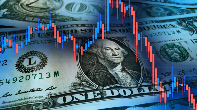
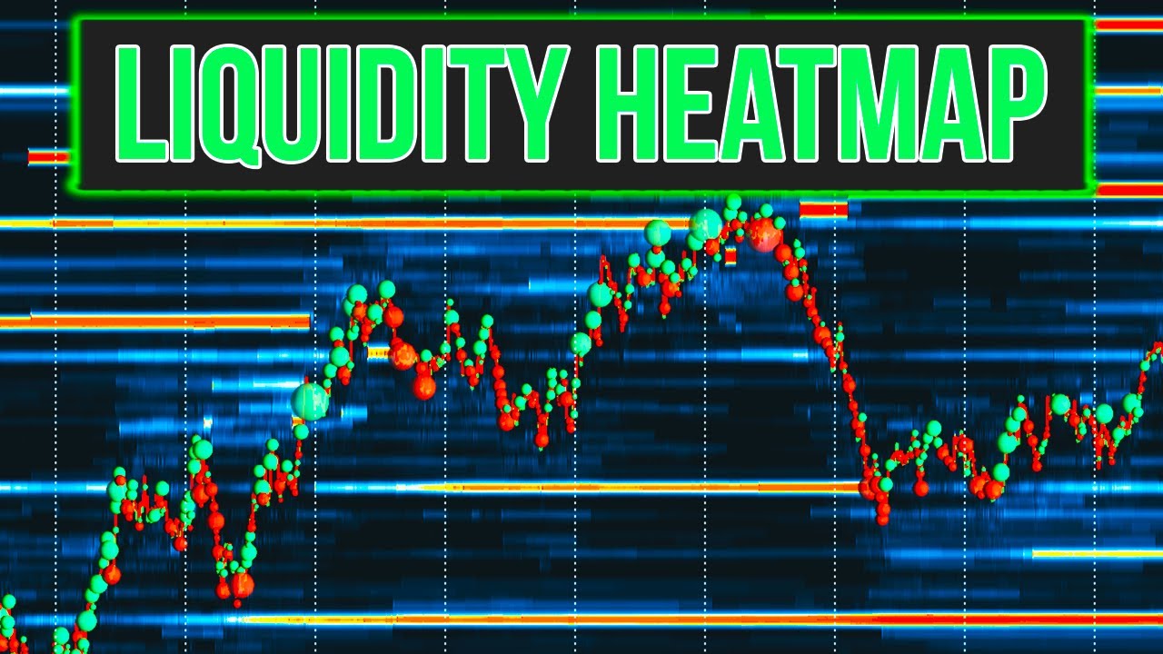
Numbers tell a story, but pictures often tell it faster. For institutions tracking stablecoins, heatmaps have become powerful tools. They show where liquidity is concentrated, how flows are shifting, and which assets dominate in different parts of the world.
In 2025, stablecoin heatmaps are essential for analysts who need a clear snapshot of global liquidity.
Regional Liquidity Patterns
Heatmaps reveal striking regional differences.
In North America, USDC dominates due to regulatory clarity and institutional adoption.
In Asia, USDT remains the preferred instrument for trading and settlement.
In Europe, DAI sees strong adoption in decentralized lending protocols.
RMBT shows rising activity in emerging markets where alternative settlement tools are in demand.
These patterns highlight that stablecoin adoption is not uniform, but tailored to regional preferences.
Cross-Chain Liquidity Flows
Heatmaps also display how liquidity moves across chains. Ethereum still holds the largest pools, but Solana and Layer-2s are growing rapidly. Whale flows illustrate how institutions rebalance across ecosystems in search of efficiency.
Stablecoins like RMBT are beginning to appear in these flows, proving that smaller tokens can integrate into larger liquidity systems.
Whale Flows on the Map
Whale transactions appear as bright spots on heatmaps, signaling major moves of liquidity. Analysts use these visual cues to anticipate volatility or opportunities. A sudden spike of stablecoin inflows to exchanges in Asia, for instance, can foreshadow market shifts.
By mapping whale behavior, institutions gain a faster read of sentiment than from numbers alone.
Institutional Applications
For funds, heatmaps are not just tools for visualization but for decision-making. They guide capital allocation, risk management, and compliance strategies. Institutions can identify where liquidity is concentrated and where exposure may be too thin.
This helps avoid blind spots and ensures strategies are balanced across geographies and chains.
Looking Forward
As stablecoins grow in adoption, heatmaps will become more detailed and sophisticated. Institutions will demand real-time visualization of liquidity flows, peg stability, and TVL shifts.
By turning raw data into intuitive graphics, stablecoin heatmaps help institutions see not just the numbers, but the patterns behind them.