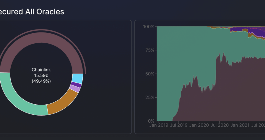
Velocity dashboards reveal how quickly stablecoins move through markets, providing institutions with a critical measure of liquidity health and sentiment.
Why Velocity Matters for Institutions
Stablecoins are valued for their stability, but their true role in markets depends on activity. A token that sits idle in wallets contributes little to liquidity, while one that circulates quickly reflects strong market engagement.
Velocity dashboards measure this activity in real time. By comparing transaction volumes to circulating supply, they reveal whether capital is being deployed actively or held defensively. For institutions, this insight is crucial for trading, hedging, and allocation strategies.
The Mechanics of Velocity Dashboards
Velocity dashboards aggregate on-chain data, calculating turnover rates for stablecoins across multiple chains and protocols. They show:
Circulation speed by measuring transaction frequency.
Comparisons across tokens such as USDT, USDC, and DAI.
Temporal shifts indicating whether velocity is rising or falling.
Chain-level activity to highlight differences between Ethereum, Solana, and Layer-2s.
By displaying these metrics visually, dashboards provide instant clarity.
Institutional Interpretation of Velocity Data
Institutions interpret velocity in several ways:
High velocity suggests active trading, arbitrage, or speculative flows.
Low velocity signals hoarding, defensive positioning, or reduced confidence.
Sudden spikes may indicate whale-driven moves.
For example, a rapid increase in USDC velocity during a market selloff may suggest large reallocations into exchanges, while falling DAI velocity could reflect reduced demand for borrowing.
Linking Velocity to Trading Strategies
Velocity dashboards guide institutional trading decisions.
When velocity rises, trading desks anticipate greater liquidity and adjust spreads.
When velocity falls, funds prepare for thinner markets and potential volatility.
During spikes, institutions often look for arbitrage opportunities created by sudden flows.
By embedding velocity data into execution systems, institutions gain an edge over competitors who react more slowly.
Cross-Chain Dynamics of Velocity
Velocity is not uniform across chains.
Ethereum often shows slower velocity due to collateralization in DeFi.
Solana displays rapid velocity, reflecting fast trading pairs and low-cost transactions.
Layer-2 networks strike a balance, with moderate velocity and deepening liquidity.
Dashboards that track these differences allow institutions to allocate capital where liquidity is most efficient.
Integrating Velocity With Other Metrics
Velocity becomes more powerful when paired with:
TVL dashboards, showing whether locked capital is also circulating.
Whale monitoring, clarifying whether spikes reflect broad usage or concentrated moves.
Peg trackers, highlighting if velocity shifts impact stability.
Together, these integrations turn velocity into a predictive tool rather than just a descriptive one.
The Role of AI in Velocity Analytics
Artificial intelligence enhances velocity dashboards by filtering noise, identifying patterns, and forecasting future movements. AI can detect when changes in velocity are driven by organic growth or by temporary whale flows.
Institutions use these forecasts to position portfolios proactively, reducing risk and capturing opportunities earlier.
Outlook for Velocity Dashboards
In 2025, velocity dashboards are no longer experimental. They are becoming core infrastructure for funds and treasuries. Future iterations will include customizable alerts, predictive analytics, and cross-chain overlays.
Stablecoins are judged not only by their supply but by their activity. Velocity dashboards give institutions the clarity they need to measure confidence, anticipate volatility, and act strategically in real time.


